About Lessons Learned
Even seasoned analytics professionals still learn on the job – in fact, it’s practically written into the job description. As can be expected, some of the hardest lessons come from situations where we “should have known better”. This section of the HealthcareAnalytics.info website is where we can learn from our successes, failures, and mistakes and will document those situations (even when they’re embarrassing!) where we’ve learned a valuable lesson in the practice of analytics. (In other words, this is where I will come clean and admit the mistakes I’ve made along the way – and I look forward to hearing of your own lessons learned in healthcare analytics, as well!)
Business Intelligence is nearing mission-critical status. Are your analytic applications ready?
As more data is available to decision makers via the growth of health information technology (HIT), up-to-date information is critical for effective and efficient management of healthcare organizations (HCOs). So many urgent decisions are being made with high-reliance on the latest information that decision support tools (i.e., analytic or business intelligence applications such as dashboards) are actually bordering on “mission critical” status.
Dashboards can present the status of performance-critical indicators in a glance, so therefore are one of the more common analytic applications used by HCO decision-makers on a regular basis. Dashboards used in operational environments (such as Emergency Department patient flow management), where the quickest decisions need to be made, are often based on real-time (or near-real-time) data from clinical systems to ensure that the most up-to-date information is available. To help quickly highlight current performance status, most well-designed dashboards feature the color-coding of metrics to highlight performance (i.e., a “green zone” indicates acceptable performance, whereas an indicator “in the red” highlights an unacceptable value.
But what if the “real-time” data is out of date?
Our Analytics Lesson Learned
We have been working on developing a performance dashboard for our local Emergency Departments to track current status (i.e., patient volumes, lengths of stay, etc). Emergency department management (and other hospital executives) are using the dashboard to monitor how well the Emergency Department is functioning. As is typical of complex health information systems, however, there are many points of failure between the source system (our Emergency Department Information System) and the dashboard. These potential points of failure include database replications, ETL processes, and the dashboard software itself. A failure at any one of these points could result in incorrect data being posted to the dashboard.
Because we know that people would be using the dashboard to make time-sensitive decisions and needed to know the most up-to-date information available, our original dashboard design clearly indicated both the data refresh time and the report execution time were listed. The goal was to provide an idea to the users of how “fresh” the data was (for example, if the data update process failed, users would see a growing gap in the time the data was last updated to the time the dashboard was refreshed). Despite this, if the data ever did become out of date due to a technical failure, the decision makers would not make always make the connection that the data was stale. Management used the dashboard for finding Emergency Department performance information, and expected the data to be correct and therefore didn’t always check the data refresh time.
The Solution
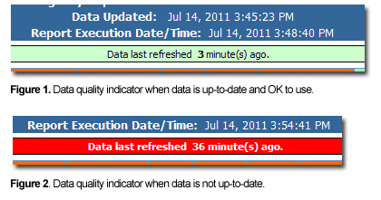
The team decided to update the dashboard to make it clear when there was a potential gap in the data being updated. In hindsight, the solution is obvious and straightforward – simply include an indicator for how recent the data is. In addition to displaying the data and dashboard refresh times, we added a clear visual cue to bring attention if data was getting out-of-date. This indicator was added to the top of the dashboard just below the refresh times. Data from our Emergency Department Information System (EDIS) is updated every five minutes, so if the data has not been refreshed in 10 minutes, there is likely a technical issue.
As per the illustration below, if the time since the last data refresh is between 0 and 10 minutes, the indicator is green (Figure 1); yellow if the data is between 10 and 20 minutes old; and if the data is 20 or more minutes out of date, the indicator is red (Figure 2). At this point as well the system will send an email alert to the appropriate persons regarding a potential technical issue with the real-time data.
This simple indicator alone has dramatically reduced the number of calls inquiring about why the data “doesn’t look right”, and has decreased response time to technical issues because the IT department is now being notified much sooner as a result of issues being spotted sooner.
Summary
We learned that when users rely on accurate and timely information to make critical decisions, it is important to let them know at a glance how reliable the information is. Rather than making the user calculate for themselves whether or not the data is recent, take away the guesswork and include whatever data quality indicators are necessary and available for use on real-time dashboards and other systems with which time-sensitive decisions are made.


{ 0 comments… add one now }